Custom styles
You can tailor the existing Lute themes by using your own custom styles in the Settings menu. These overrides are applied after the theme selected.
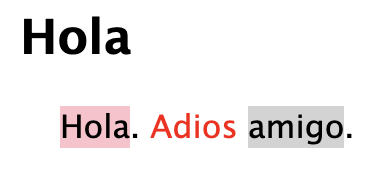
Open Settings, and in the "Custom styles" text box in the settings, enter valid CSS. For example, this:
span.textitem { font-size: 16px; }
span.status1 { background-color: pink; }               /* status2-5 for the rest */
span.status98 { background-color: lightgrey; }         /* Ignored terms */
span.status99 { background-color: none; color: red; }  /* Well-known terms */
yields this:

Styling examples for your inspiration
Change colors
fyi the CSS selectors for the statuses are span.status1 through span.status5, with .status98 for ignored and .status99 for well-known.
 span.status0  { background-color: #ADD8E6; }  /* Unknown. */
 span.status1  { background-color: red; }
 span.status2  { background-color: red; }
 span.status3  { background-color: orange; }
 span.status4  { background-color: orange; }
 span.status5  { background-color: green; }
 span.status98 { background-color: white; }    /* Ignored. */
 span.status99 { background-color: white; }    /* Well known. */
Language-specific styles
You might want different colors or font sizes for different languages. You can get the language ID by clicking on it in the language listing (Settings > Languages), it's at the end of the URL; e.g., http://localhost:5001/language/edit/9, "9" is the ID.
span.textitem[data-lang-id="2"] { font-family:"Comic Sans MS"; }
span.status0[data-lang-id="8"] { background-color: red; }
span.status0[data-lang-id="4"] { background-color: blue; }
Larger text with more space between each line
div#thetext p { line-height: 2; }
span.textitem { font-size: 18px; }
Hide the green checkmarks at the bottom of the reading pane
Clicking the green checks sets unknown to well-known, which you might not like.
#footerMarkRestAsKnown { display: none; }
#footerMarkRestAsKnownNextPage { display: none; }
Text justification
div#thetext {
  text-align: justify;
  text-justify: inter-word;
}
Paragraph spacing
#thetext p:after {
  content: "\00a0"; /* Adds a non-breaking space */
  display: block;
  margin-bottom: 10px; /* Adjust the value for the desired space */
}
Hide the frame borders
The reading page has frames for the content and the form and dictionaries. Hide the borders with this:
#read_pane_right::after {
    background-color: transparent;
    width: 4px;
}

.dictframecontainer::after {
    background-color: transparent;
    height: 4px;
}
Increase the size of the term pop-up text
div.ui-tooltip { font-size: 150%; }
Vertical text for Japanese
div#thetext {writing-mode: vertical-rl;}
Why would you ever do this?
body { font-family: "Comic Sans MS"; }
Yuck.
Notes:
- The styles used by Lute out-of-the-box are in the GitHub repo, hack away!
- The data you put in the text box must be valid CSS, as it is picked up verbatim and inserted into the HTML.
- Some of the current css class names are bad (e.g. "status98" means "ignored", but that's pretty hard to follow). If those class names get changed in a future release, I'll add a note in the release notes.
- Using css is pretty tricky, but it works for now!